ONLINE CHECK-IN
company: Enterprise Mobility
timeline: 10 months
team: Nicole Galisatus (Enterprise designer), Yuliia Yarema (Alamo designer)
project overview
The Online Check-In experience is designed for two car rental brands under the Enterprise Mobility portfolio (Enterprise Rent-a-Car and Alamo). Unlike traditional in-person check-in at the rental branch, this digital experience allows customers to check in from their personal device or a kiosk. By removing the need to wait at the counter, customers can bypass the branch entirely and proceed straight to the lot, significantly reducing pickup time.
the problem
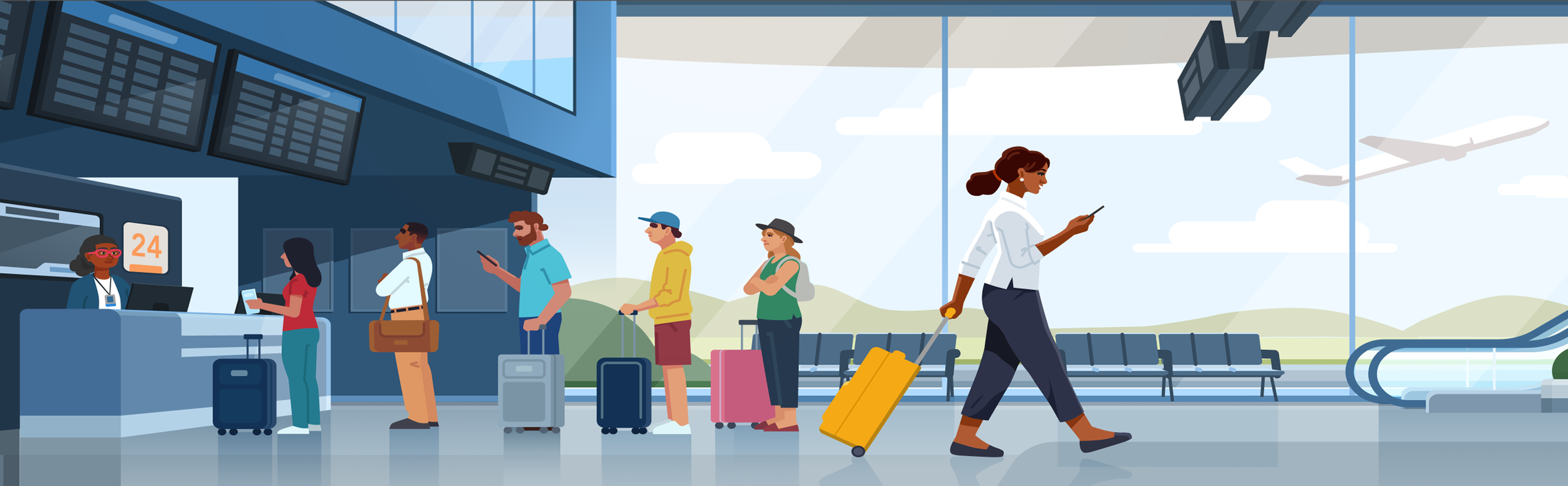
Peak travel seasons at Enterprise car rental branches often result in long lines to check in, stressing operations and frustrating customers.
the solution
a digital check-in experience
Design a digital check-in experience via personal devices and dedicated kiosks so customers save time by skipping the counter and proceeding straight to the lot. The goals of this experience are to:
01 Provide various check-in options including in person, personal device, and kiosk
02 Alleviate stress on Enterprise operations
03 Increase customer satisfaction by reducing time spent checking in
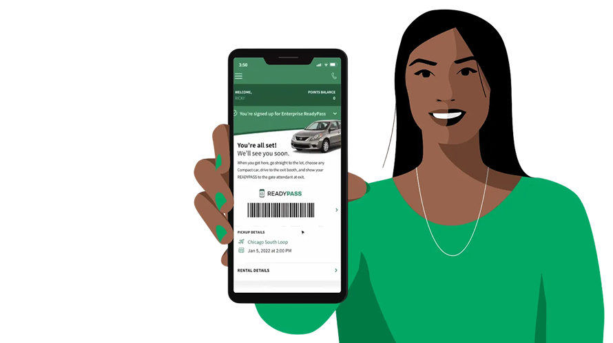
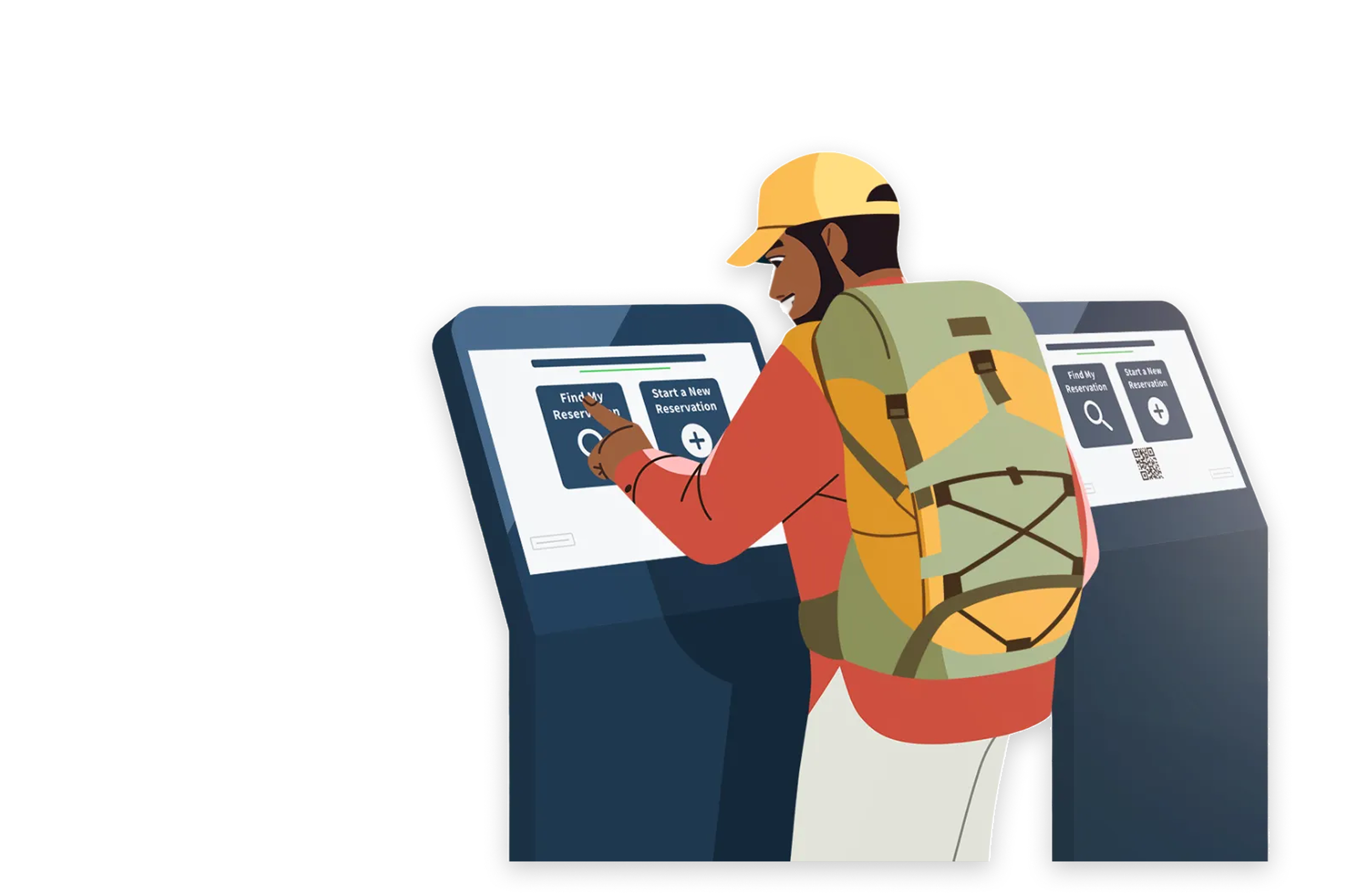
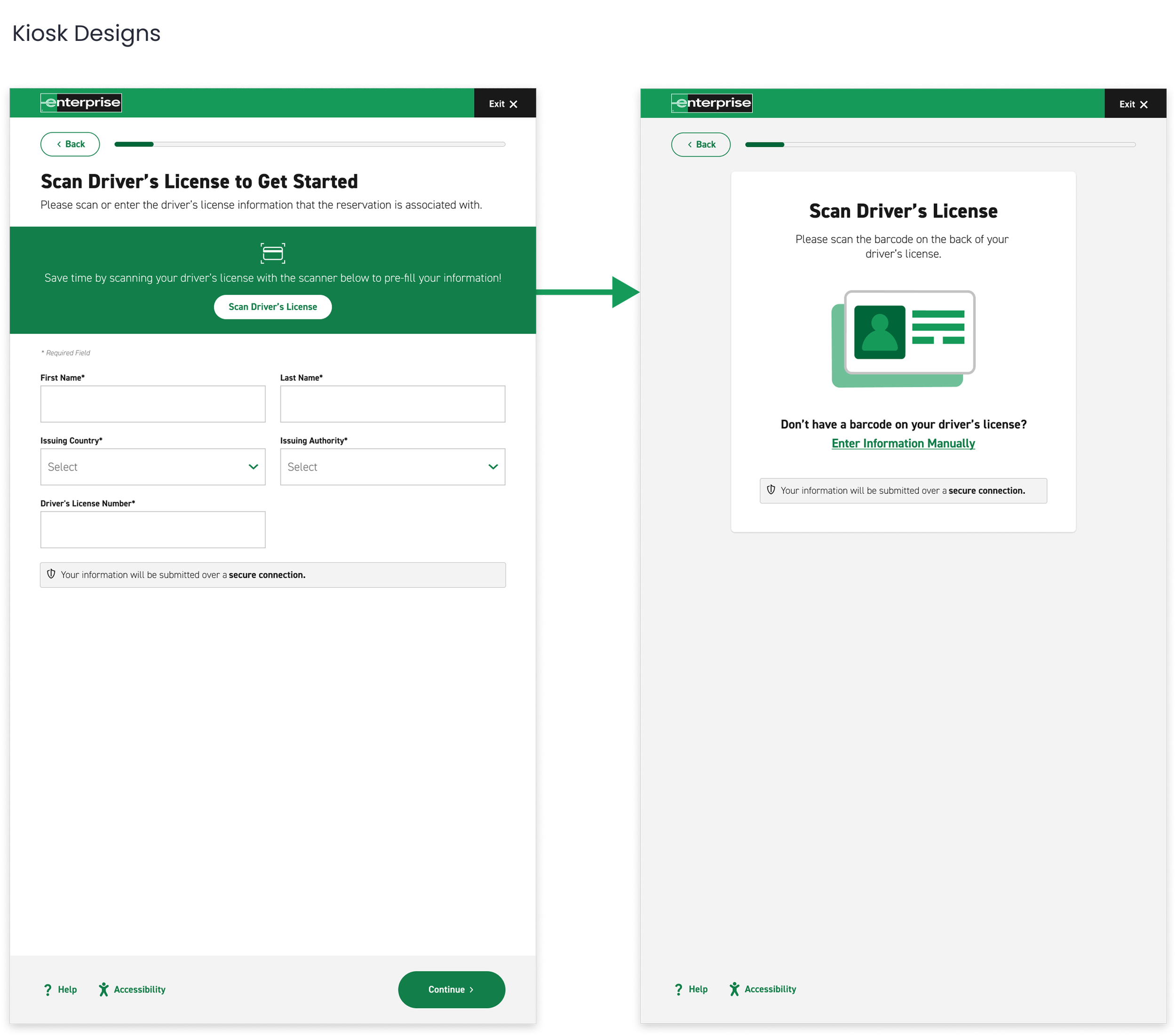
kiosk prototype

key features
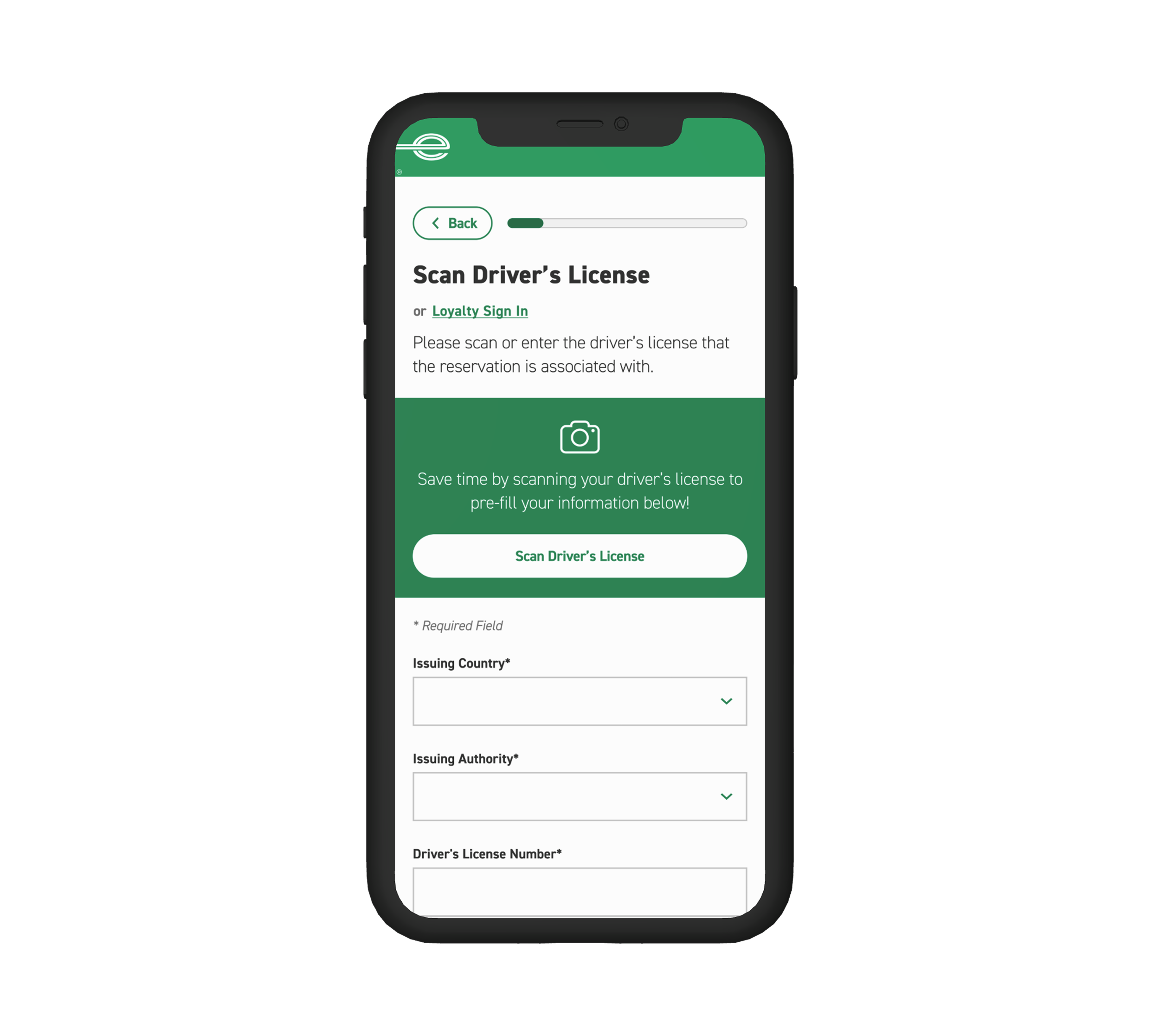
driver’s license scan
Collect driver’s license information through virtual scan feature in order to look up or create a driver’s profile.
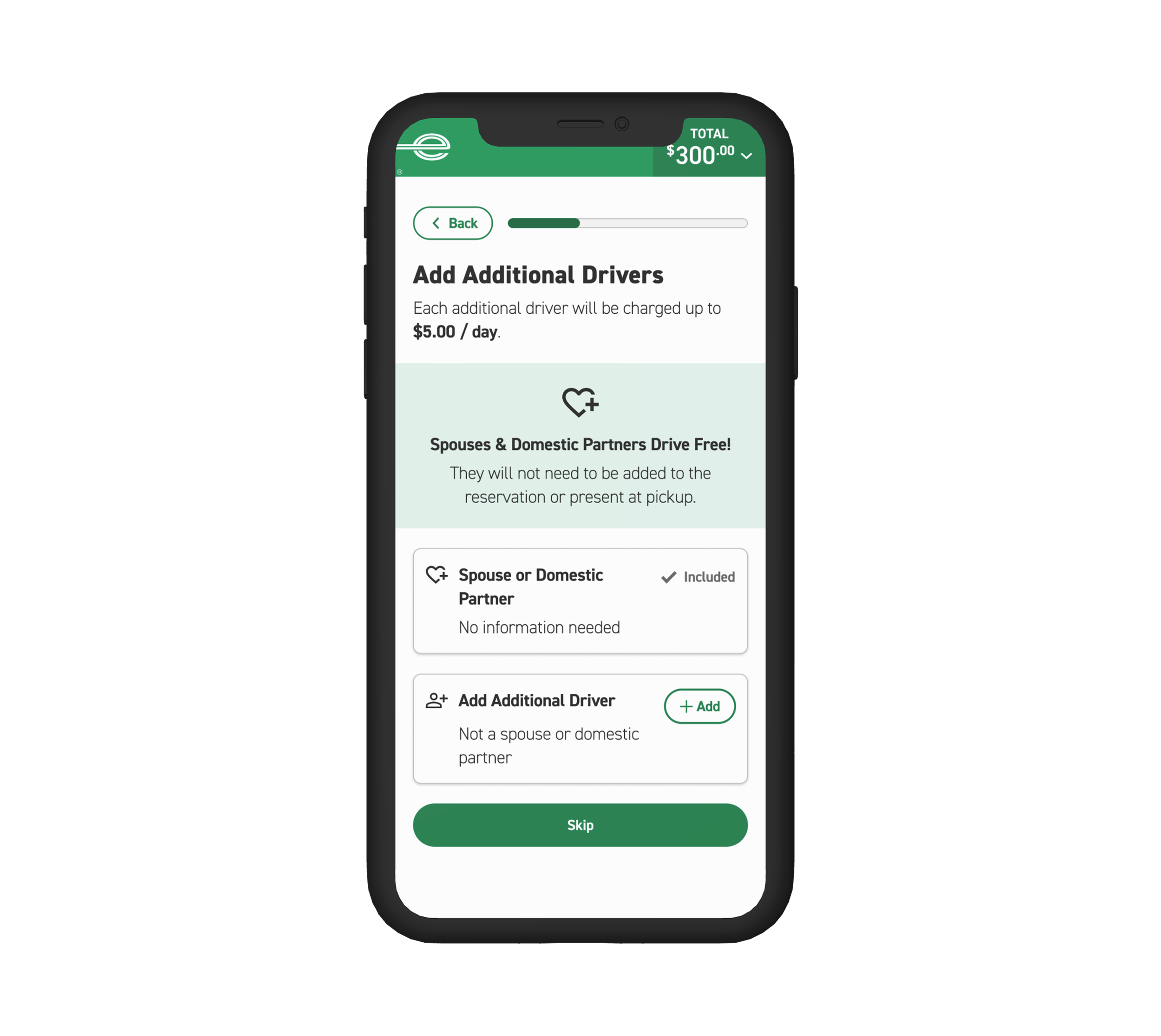
additional driver
Allow customers to add an additional driver to their reservation.
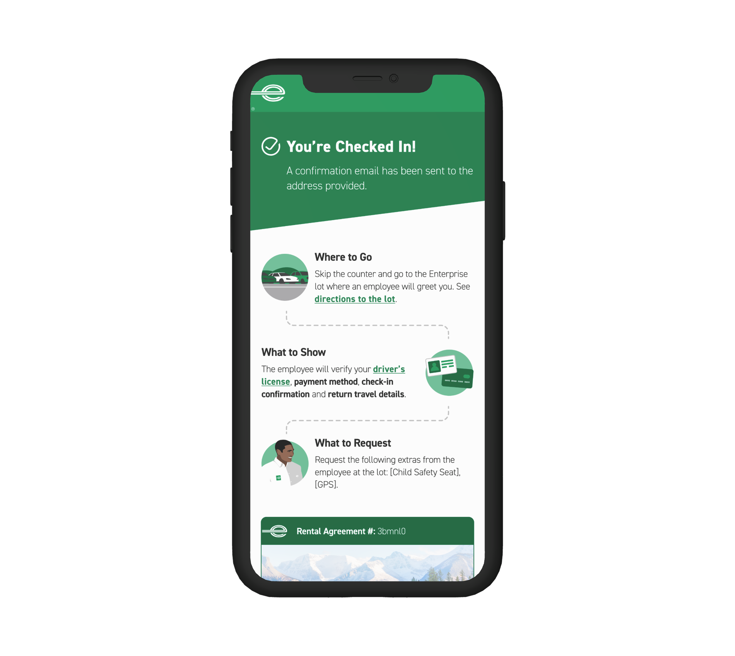
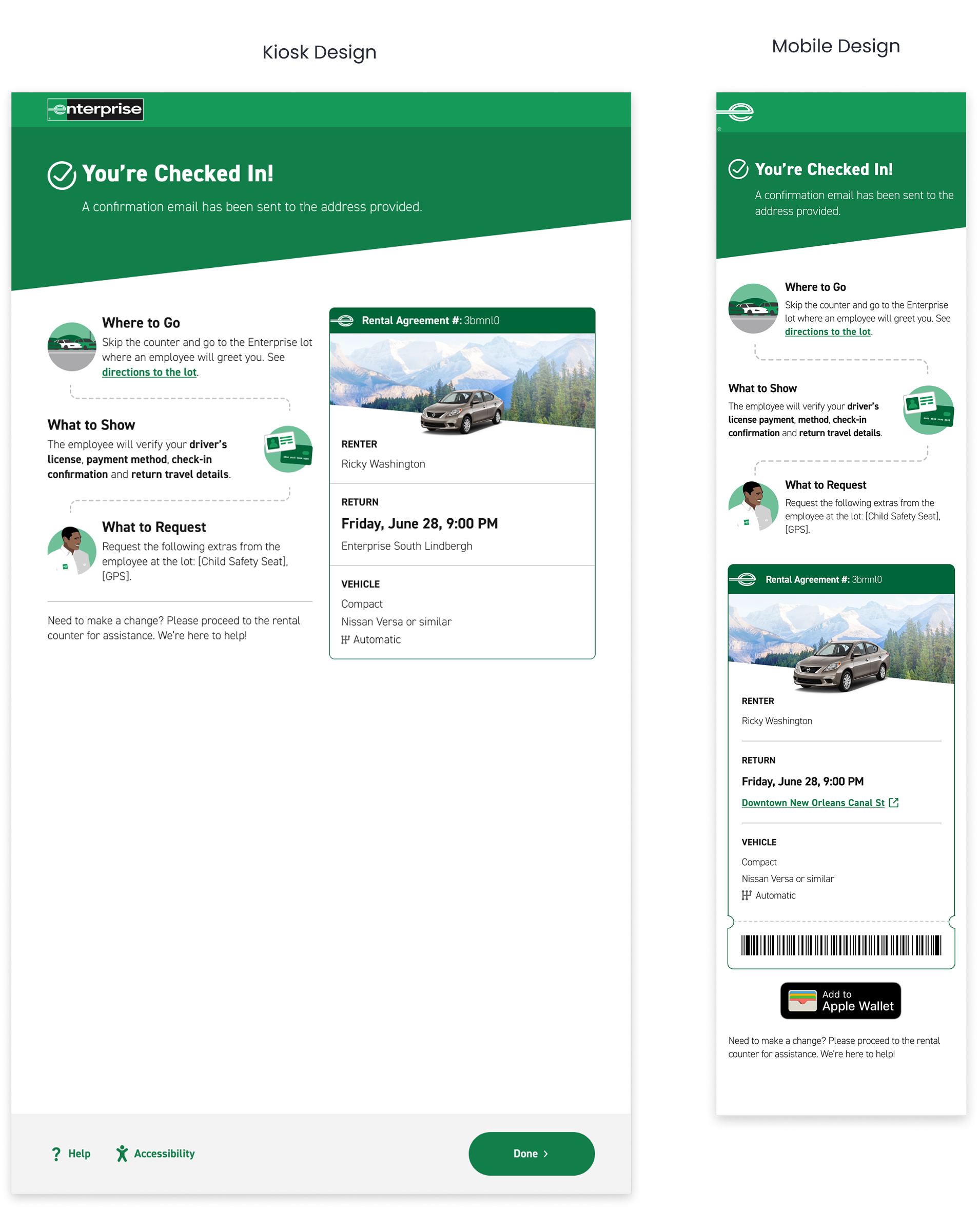
confirmation page
Signal check-in completion, communicate next steps, and summarize rental details.
how did I arrive at this solution?
read on to learn about my process!
design process

01 discover
User interviews help define key priorities

02 design
From sketches to high fidelity prototypes

03 test
Validate and iterate
01 discover
customer surveys
Our research team surveyed 3,786 customers who have rented with Enterprise in the last 6 months in order to understand both customer and operations needs for checking in for a rental vehicle
process
Media survey (closed and open ended questions)
audience
3,786 customers who have rented with Enterprise in the last 6 months
check-in time vs. customer satisfaction
Surveys revealed that waiting longer than 10 minutes is a major breaking point for customers.
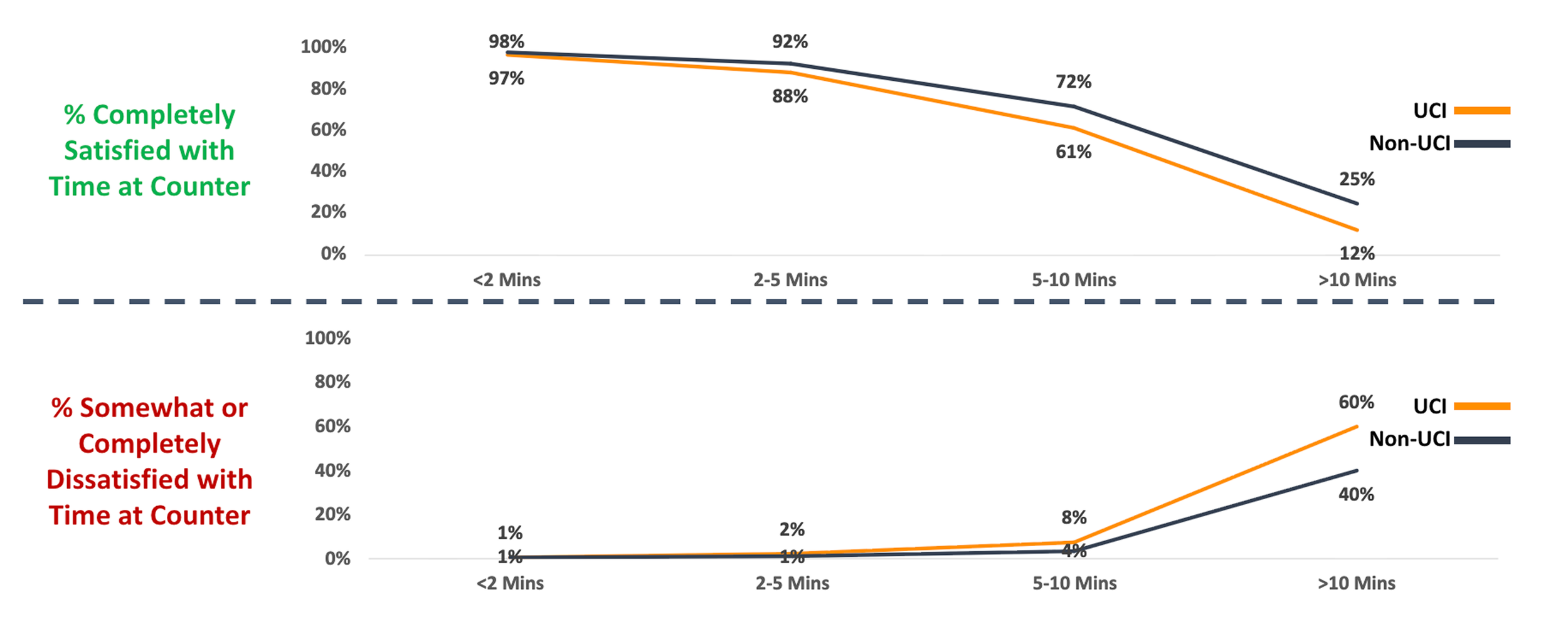
personal device vs. counter
72% of customers would prefer to use their personal device to complete check-in tasks vs. the counter.
Most customers who prefer to use self-serve check in would choose their personal device due to the perception that it is faster than waiting in lines and employee interaction.
personal device vs. kiosk
64% of customers would prefer to use their personal device to complete check-in tasks vs. the kiosk.
Some customers would use a kiosk to check in if their personal device is not available due to battery life or connectivity issues. However, others were concerned about the security of kiosks when submitting personal information.
key survey insights & principles
01 efficiency
In order to maximize customer satisfaction, the check-in process should be efficient and take no longer than 10 minutes.
02 flexibility
While self-service check-in is highly preferred, customers need flexible options due to dynamic factors such as personal device availability.
03 security
Since check-in involves the collection of personal information, self-service options must be secure.
how might we…
01 create efficient check-in steps to expedite time at the branch?
02 incorporate flexible check-in options to accommodate customer preferences and constraints?
03 assure customers that the self-service check in process is secure?
02 design
let’s dive into three key check-in features and see how efficiency, flexibility, and security were accounted for!
feature 01: driver’s license scan
collect driver’s license information in order to look up or create a driver’s profile.
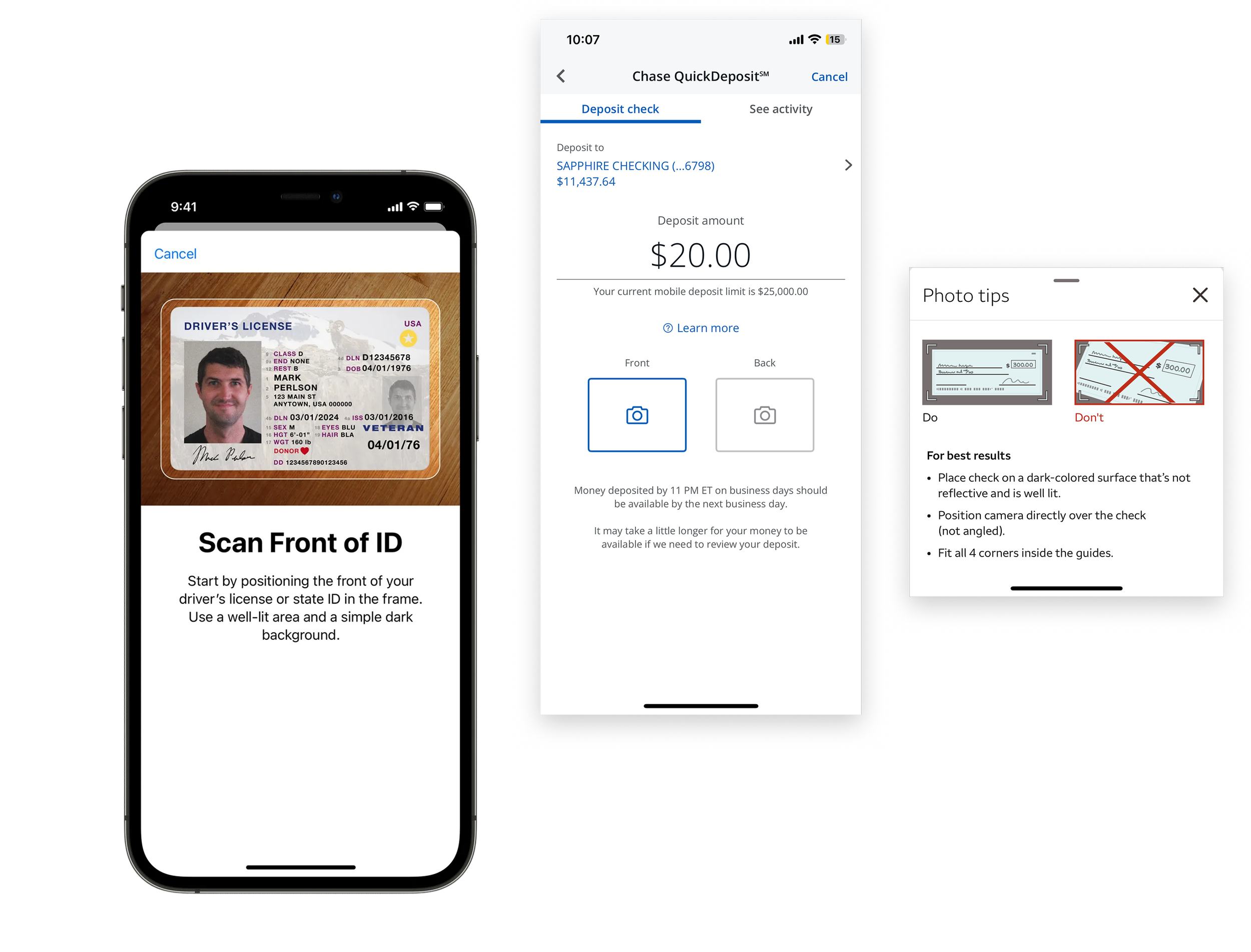
competitive analysis
Apple digital ID and Chase/Wells Fargo mobile check deposit
Apple’s digital ID and Chase and Wells Fargo mobile check deposit all allow virtual scanning of customer documents as Enterprise would allow the scanning of a driver’s license. In order to accomplish this well, Apple, Chase, and Wells Fargo provide clear scanning instructions, automatic capture, viewfinder guidelines, and tips for error prevention.
iterations
The green highlighted areas show four distinct design approaches for initiating a driver’s license scan for Enterprise check-in.
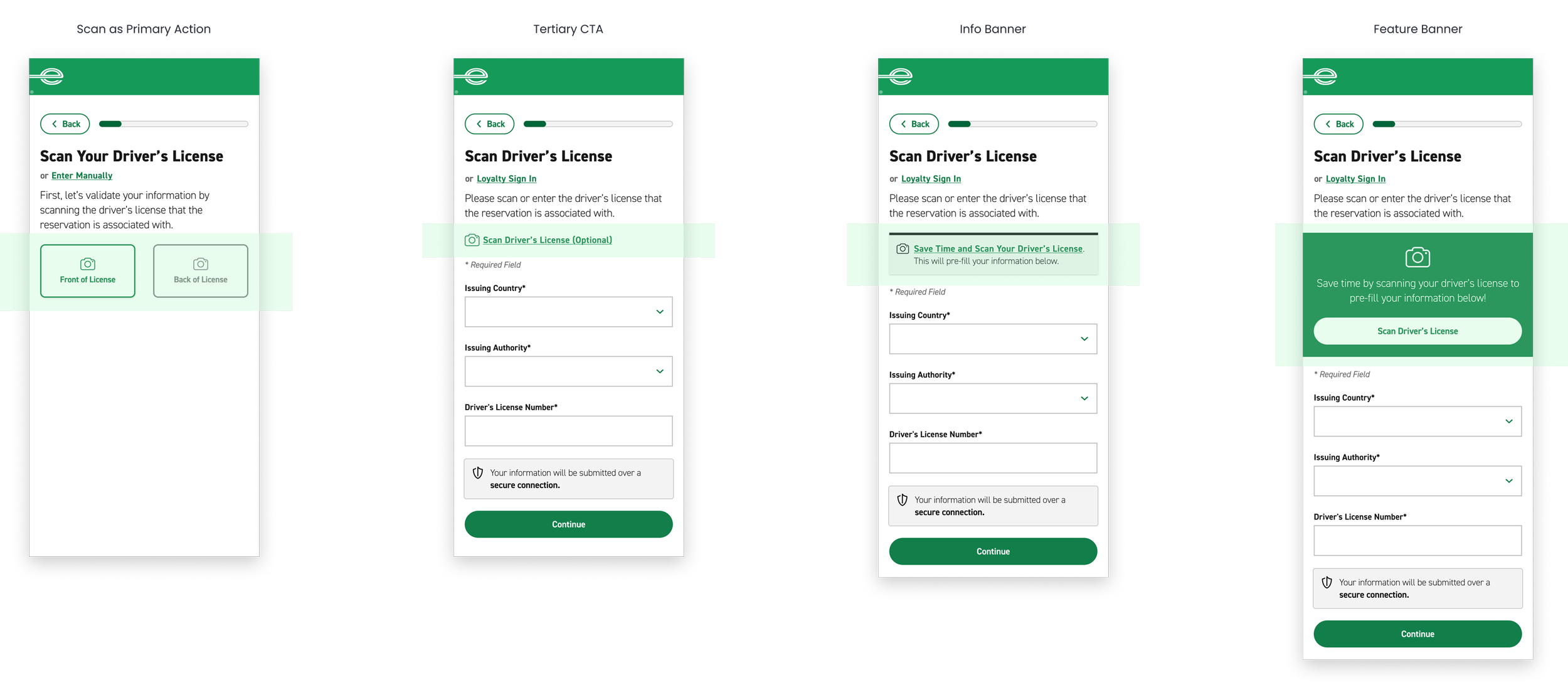
final designs: driver’s license scan
efficiency
• Highlight time-saving value proposition with scan feature
• Automatically capture scan for customer via barcode
• Provide visibility of system status with yellow bar animation
• Provide quick tips for error prevention
flexibility
• Provide the option for manual entry or loyalty sign-in
security
• Display form fields to allow customers to verify information
• Notify customers of secure submission process
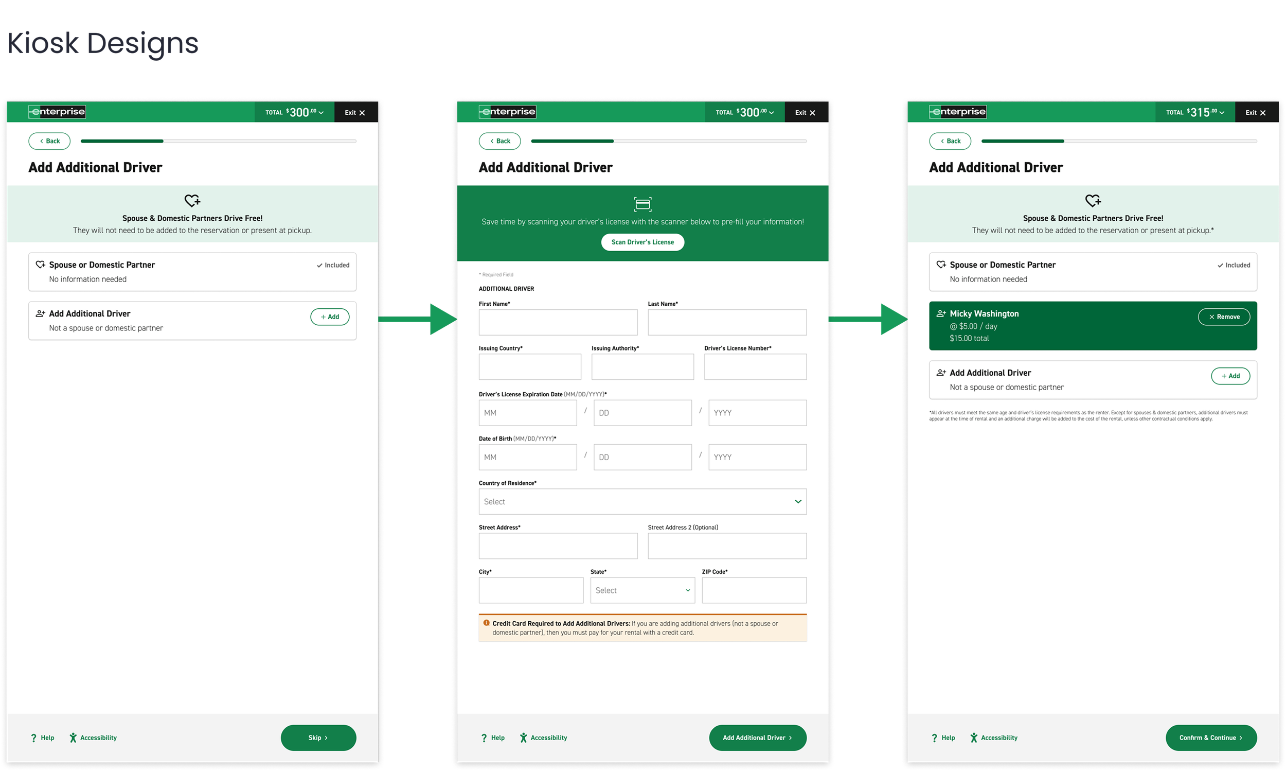
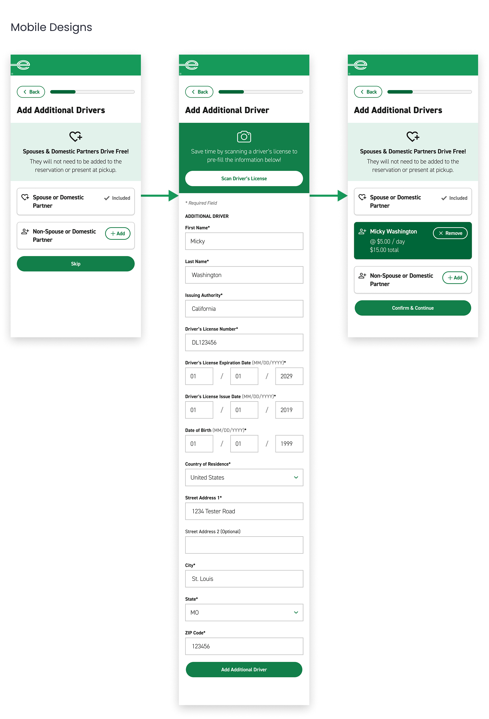
feature 02: additional driver
allow customers to add an additional driver to their reservation. spouses drive for free and do not need to be added.
I iterated 3 different additional driver flows and tested each via usability testing.
❌ iteration 1
usability testing pain points
4 out of 6 users did not read the spouse policy, completed form fields and mistakenly added their spouse to the reservation for a charge.
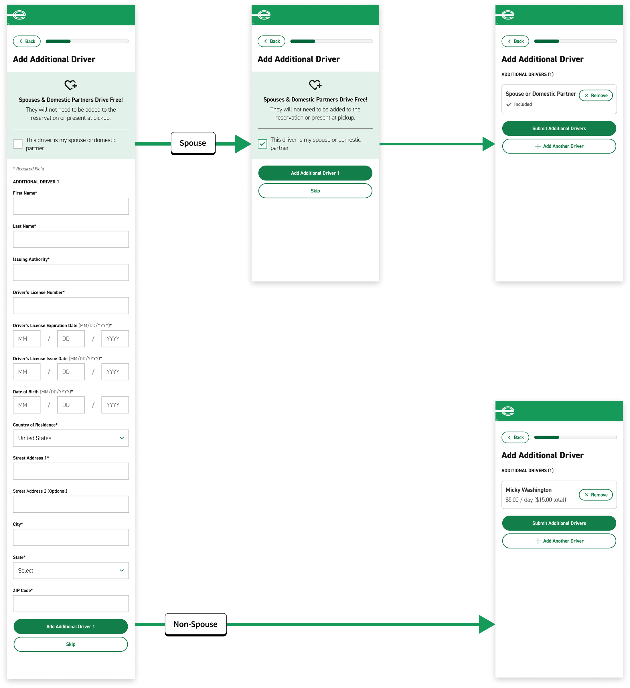
🟡 iteration 2
usability testing improvements
By providing 2 CTAs of equal hierarchy, all users understood the distinct pathways.
operations pain points
This process does not match the real world process. A spouse cannot be added to reservation documentation.
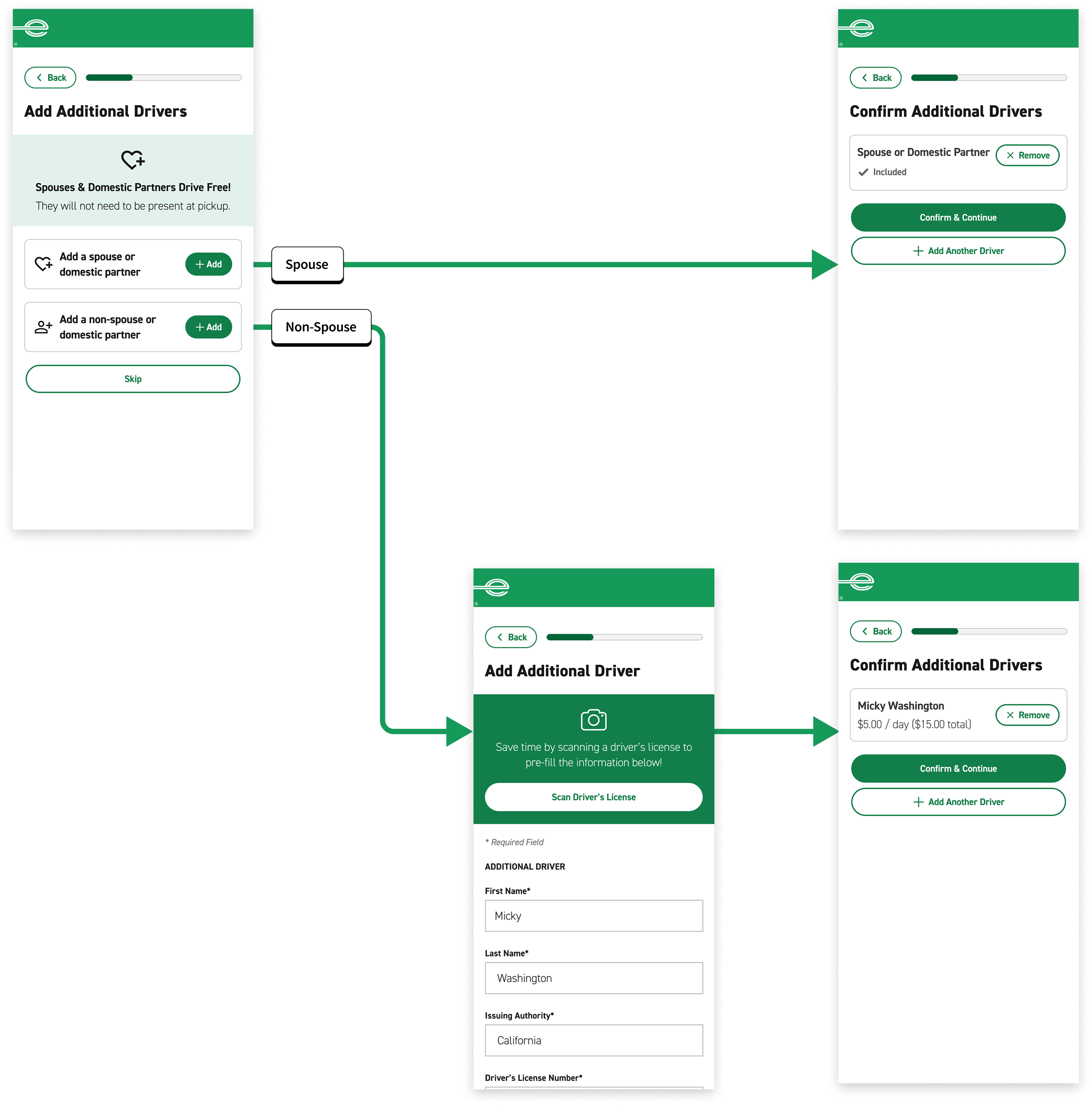
✅ iteration 3
usability testing improvements
By providing cards with clear labels, all users understood the distinct pathways.
operations improvements
Digital process matches real world process where only a non-spouse needs to be added to the reservation.
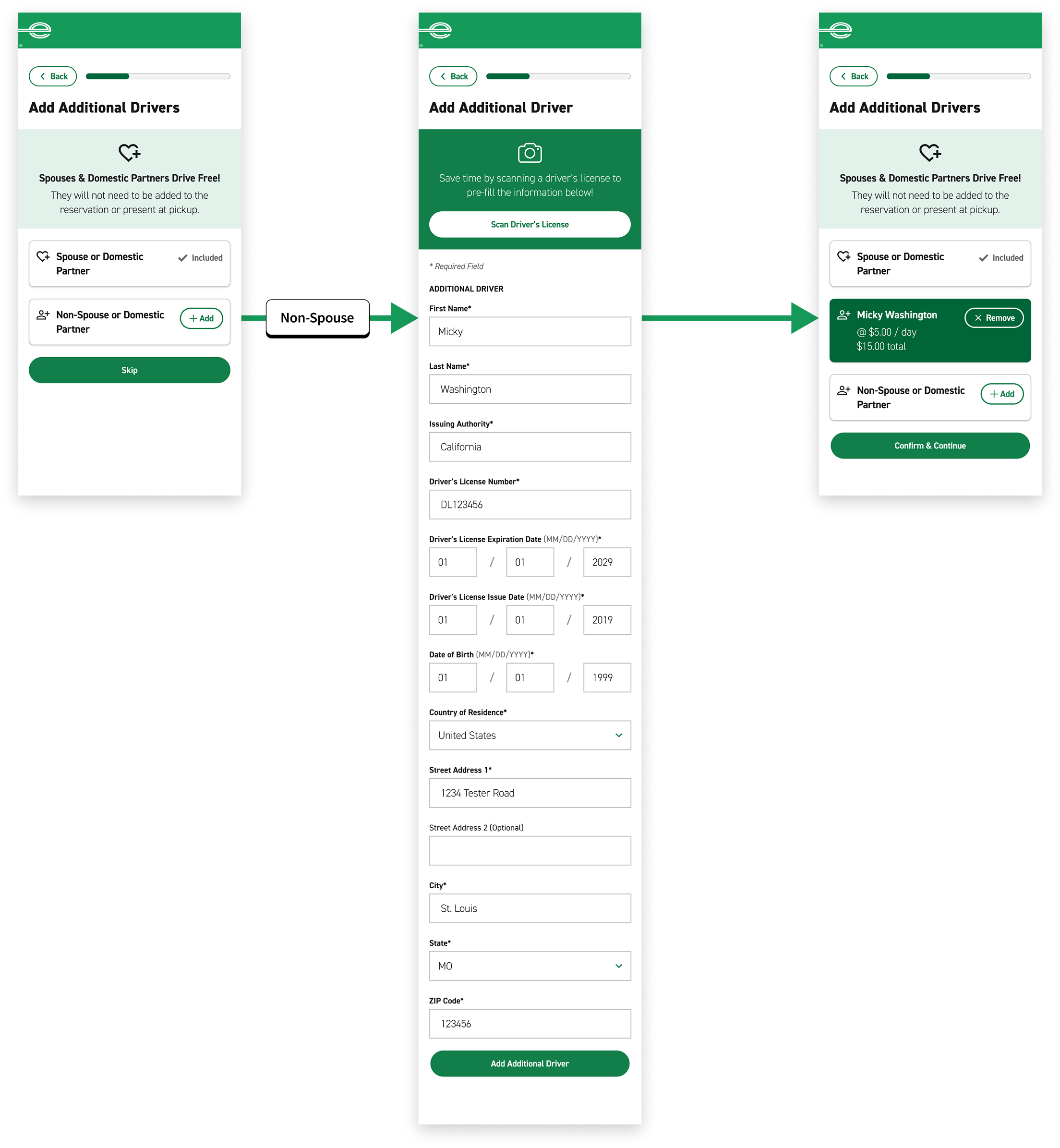
final designs: additional driver
efficiency
• No action needed for spouses
• Highlight time-saving value proposition with scan feature
flexibility
• Provide the option for manual entry
• Easily add or remove drivers
security
• Display form fields to allow customers to verify information
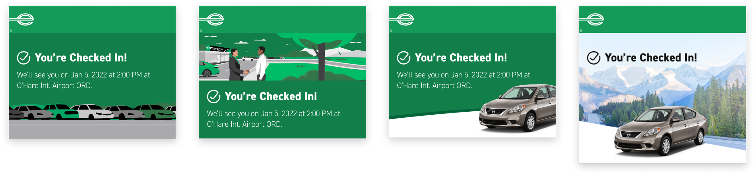
feature 03: confirmation page
signal check-in completion, communicate next steps, and summarize rental details
competitive analysis
ticketing and flights
Eventbrite and Southwest use the notch and perforation pattern to resemble a physical ticket on their confirmations. They also employ visual hierarchy to highlight the most important information.
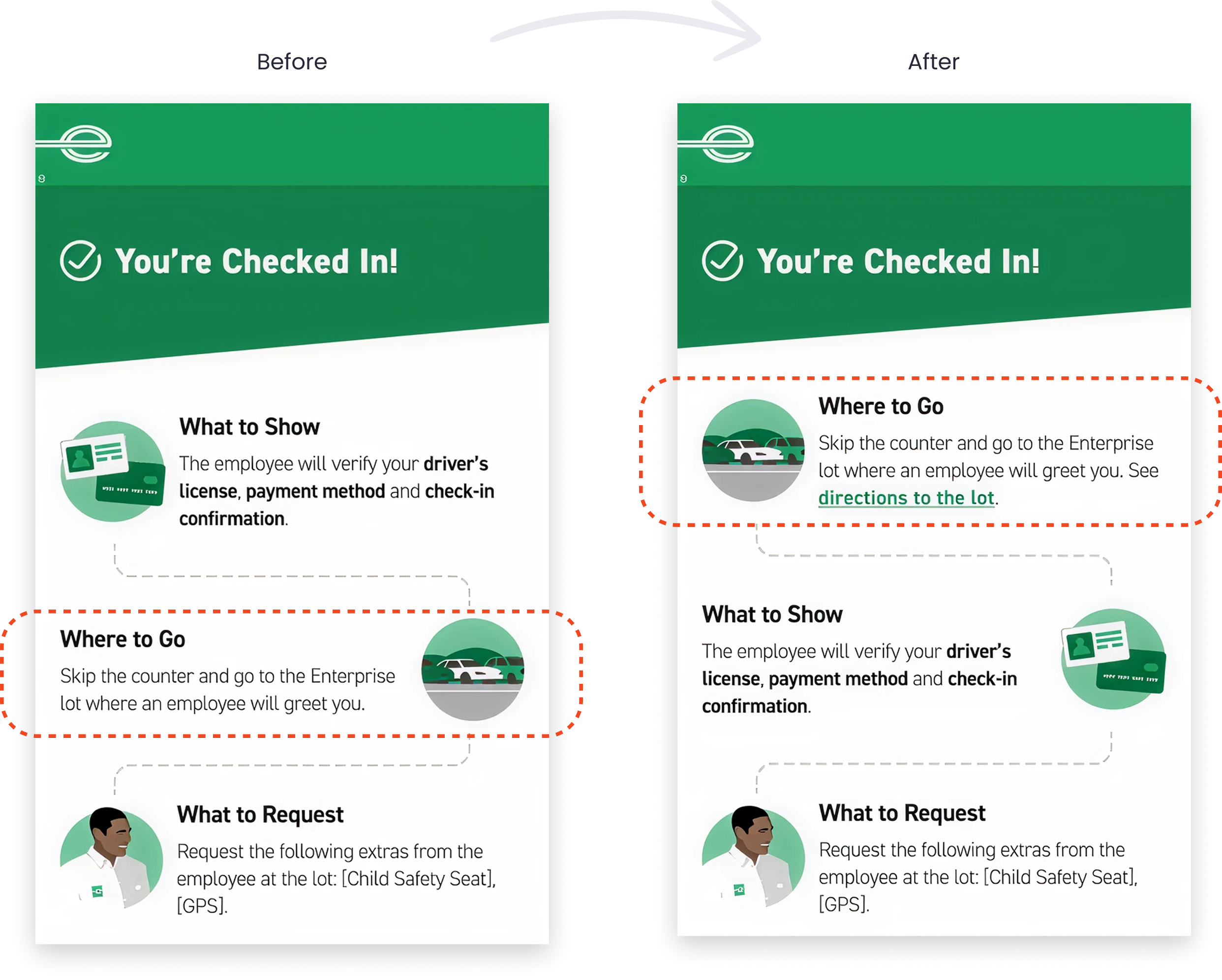
iterations
checked in status
First, the confirmation page should include a bold status indicator to signal to customers that they have completed the check-in flow. I explored various illustrations and hero imagery to complement the message.
next steps after check-in
Next, I explored various ways to detail what the customers need to bring, where they need to go, and what they need to do upon arrival at the rental branch now that they have checked in.
rental summary
Lastly, I explored ways to summarize the customer’s rental information such as the location, date, time, and vehicle, taking inspiration from Eventbrite and Southwest.
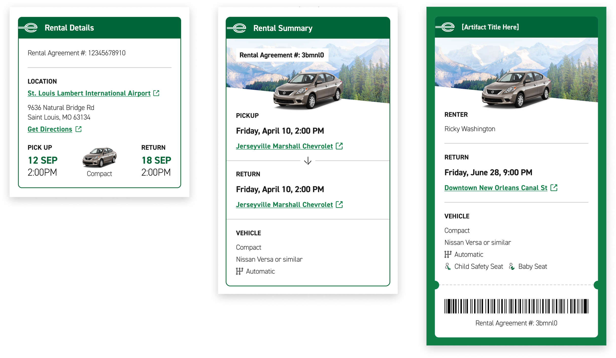
final designs: confirmation page
efficiency
• Reduce cognitive load by introducing visual hierarchy
• Frame next steps as a friendly informational to optimize digestibility
flexibility
• Provide the option to add to Apple Wallet and send confirmation to email
security
• Require that customers present documents for identity verification at the lot
• Include a barcode for employees to verify the reservation
03 test
goal
Ensure customers understand the check-in process and can complete the flow without friction.
process
3 rounds of moderated usability testing with 5 participants per round that have rented from Enterprise in the past year
result
All users found check-in to be easy and intuitive and would utilize this offering.
key insights
01 customers were excited by time saving features such as driver’s license scan
02 customers were able to easily modify reservation details
03 customers were concerned about navigating to the lot without verbal direction
issue 01: navigating to the lot
observation
2 out of 5 users did not immediately understand where to go after checking in
solution
Re-order next steps so ‘Where to Go’ is more prominent and matches order of operations. Add custom navigation details.
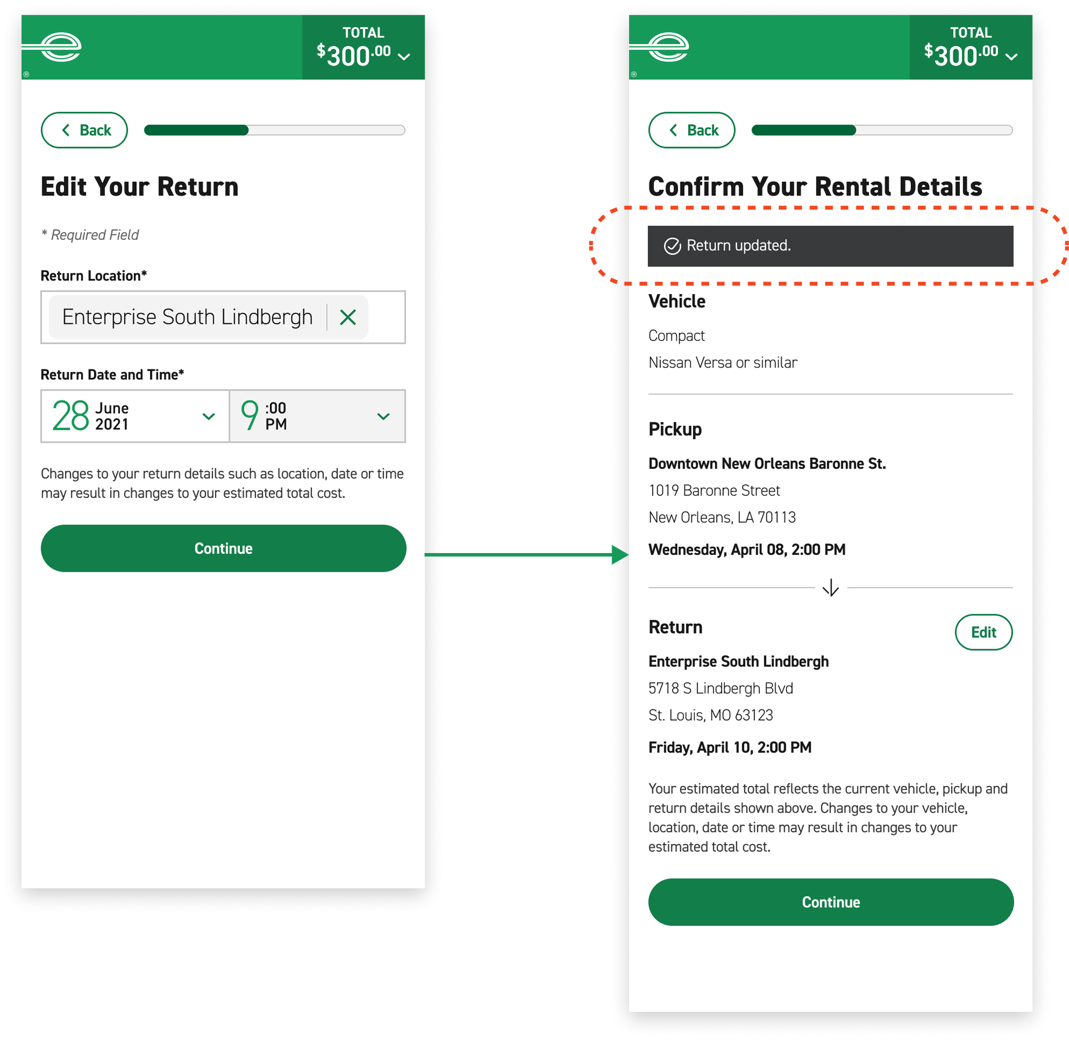
issue 02: system status
observation
2 out of 5 users expressed a desire for confirmation status after editing return details
solution
Return customers to confirmation page with toast message for system status notification.
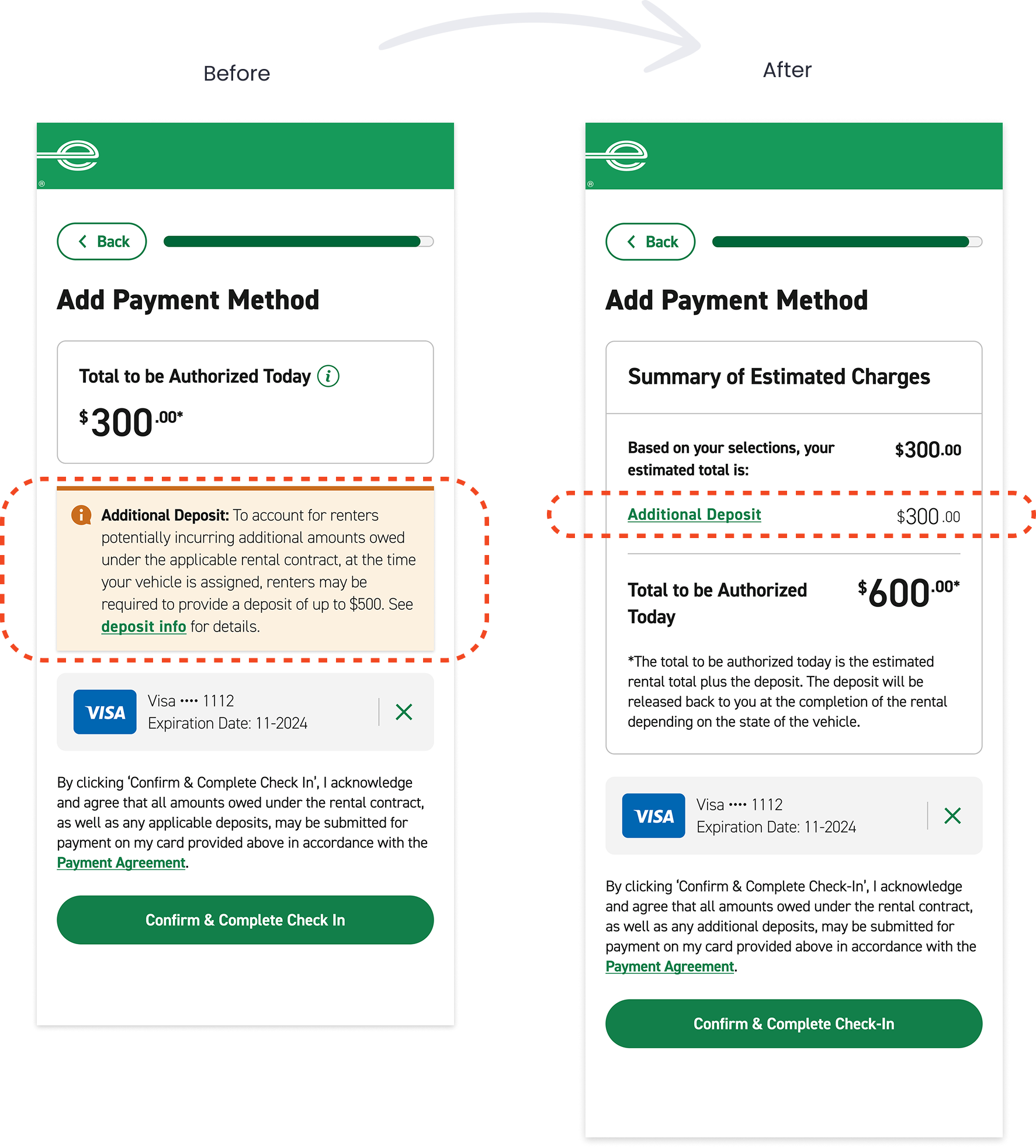
issue 03: deposit clarity
observation
3 out of 5 users were concerned about the vague language in the deposit policy
solution
Perform backend check on if customers will be charged a deposit and itemize it in the total
key performance indicators
As the check-in project pilots, we will track customer satisfaction, time spent at the branch, and check-in retention as key performance indicators. Stay tuned!
lessons learned
01 kiosk accessibility
Designing for kiosks prompted me to deepen my understanding of accessibility and inclusive design. We partnered with Level Access, an accessibility consultancy, to ensure the kiosk experience meets accessibility standards and is usable by people with a wide range of abilities. I learned that accessibility requirements for kiosks differ significantly from mobile and desktop due to increased viewing and interaction distance. As a result, primary CTAs and form field heights are nearly twice the size of those used on mobile and desktop, with all supporting UI elements scaling proportionally to maintain visual hierarchy and readability. Additionally, primary navigation is fixed to a lower navigation bar to support reachability and reduce physical strain during interaction.
02 integrating upsells
The check-in flow includes a range of upsells and add-ons—such as additional drivers, vehicle upgrades, extras, and protection options. The challenge is presenting these choices in a way that enhances the experience without slowing down or introducing friction into the check-in process. Our goal is to give customers the flexibility to customize their rental experience digitally while preserving a fast and efficient check-in.
03 tri-brand collaboration
This project was a collaborative effort between me and an Alamo designer for our respective car rental brands. Through this collaboration, I learned how to balance cross-brand consistency while preserving each brand’s unique standards and design patterns.